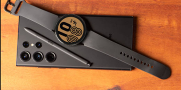
The teaser of the Pixel Watch’s design from Google that went up last week certainly got some of us excited. It’s obvious that Google has spent a lot of time fine-tuning the look of its first smartwatch to give it a unique yet premium style. By no means does that doesn’t mean it is perfect, though. The most common (and obvious) complaint stemming from that video was about the size of the watch’s bezel, prompting at least one of our readers to call it the “Pixel Watch (Bezel Edition).”
As hilarious as that nickname is, the dude wasn’t wrong – the bezel, especially in the shot of the watch face with numbers at each 5-minute marker didn’t look amazing. In fact, it made the watch look like it had an excessive amount of bezel that we haven’t seen since the early smartwatch days.
And then today, Google posted a similar video (here) to its Google Taiwan channel that has most definitely been edited from the video we saw last week, as spotted by this reddit user. In almost every single shot of a watch face, the face itself has been expanded further out, creating a visual of a smaller bezel. You can see this below in the GIF mash-up we did of each video’s watch face showcase.
So that’s good news, right? Or are we now wondering which video has the correct representation? I guess we won’t really know until the watch is official and we see it in person.
Thankfully, that should be on October 6. Please hurry, time.
Source by www.droid-life.com


