A lot of reaction stuff following a big Apple or Google or Samsung event, where they’ve revealed their next line-up of hardware devices, can be silly. It’s one side taking shots at another or pointing out who did which feature first or better. It can be fun (or incredibly obnoxious). But it can also bring out the jealousy. The new iPhone 14 Pro caught me and I’m here to now beg for Google or Samsung or anyone in Android to take note of what we just saw.
In case you missed it, Apple announced a bunch of products today, including the Apple Watch Series 8, Apple Watch Ultra, AirPods Pro 2(?), iPhone 14 and 14 Plus, and the new iPhone 14 Pro and 14 Pro Max. Most of the hardware outside of the 14 Pro series didn’t grab my attention much, but there were several ideas in Apple’s top-tier phones that I’d love to use.
Apple’s Always-On display is next level
For years, we’ve enjoyed an always-on display experience on Android, with almost everyone who makes phones for this platform utilizing it on some level. We have been able to check the time or date, see notifications, and consume limited amounts of information without having to touch our phones. The world of AOD in Android hasn’t changed much, though, and we’re basically sitting today with a similar experience to what we had all the way back in 2016.
So Apple took its sweet time and has finally delivered what it imagines an always-on display should be. I know that we’ve often mocked Apple for not adopting the idea and actually couldn’t ever figure out what was taking them so long, but I think they really nailed this.
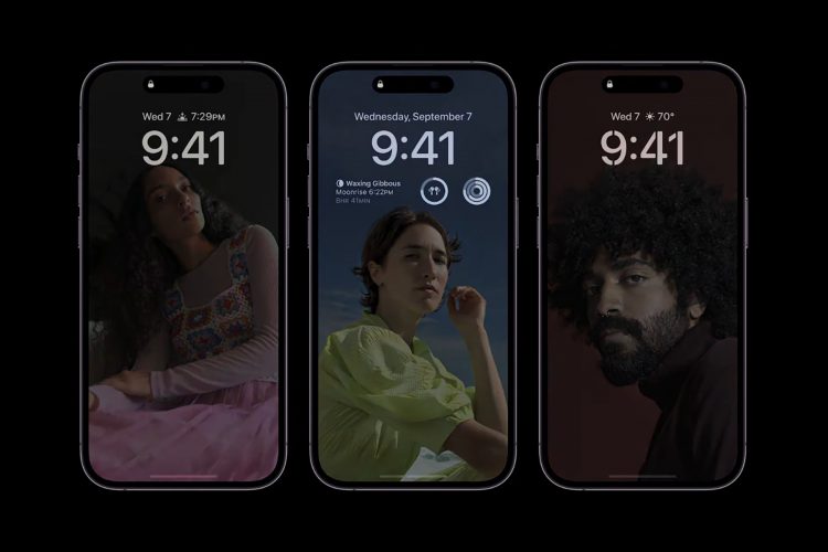
The always-on display in the iPhone 14 Pro looks like the image above. Yes, those are phones in the always-on state, with access to the weather, clock, widgets, date, and a freaking background image – in color! Even live activities, like a flight track, can continue showing on the screen in AOD mode. This is magic, man.
Apple claims their new displays in the 14 Pro line have enabled this, with things like a 1Hz low-power mode, LTPO to “intelligently dim the entire lock screen,” and the co-processors in the Pro’s A16 Bionic chip. All of those will apparently help in still giving you “all-day” battery life. And should you throw your phone in a pocket or flip it over, the screen will go dark.
On Android, our AOD is basically a black-and-white set of information we can’t change that has been preset by the manufacturer. None of the info is really live and you absolutely have to tap on your phone to wake it in order to make things happen. Also, Android ditched lock screen widgets years ago instead of using them in ways like Apple is now doing.
This one stings.
The Dynamic Island is a genius idea for a screen cutout
Apple has finally changed up its display design on this year’s iPhone 14 Pro by moving away from that drop-down notch and instead giving the world a pill-shaped cutout that houses their Face ID sensors and selfie camera. Again, like an AOD, this is not a new display move other than Apple’s shape here is different than most. On Android, we’ve had single (and double) selfie camera cutouts for a long time.
The difference here is that Apple isn’t trying to run from it as if it’s a design flaw. Instead, Apple is fully embracing the weirdness of its shape and the space it takes up to add a bunch of software features. So instead of creating a set of wallpapers to hide the cutout, Apple is saying, “We think this is cool and here’s what you can do with it.” They even named it the “Dynamic Island.”
Watch this short clip to get an idea of what you can do with the Dynamic Island:
That’s cool as hell, right? Here, Apple has turned their pill cutout into a touch-enabled area that can show you information, change size depending on what it needs to show, and more. It’ll present music controls, expand to present a notification or call, and display phone settings as you adjust them. It does it all by adjusting in real-time as if it is a thoughtfully integrated part of the system – which it is.
Again, Android manufacturers gave us wallpapers to try and blend the black camera cutout.
Emergency SOS via satellite
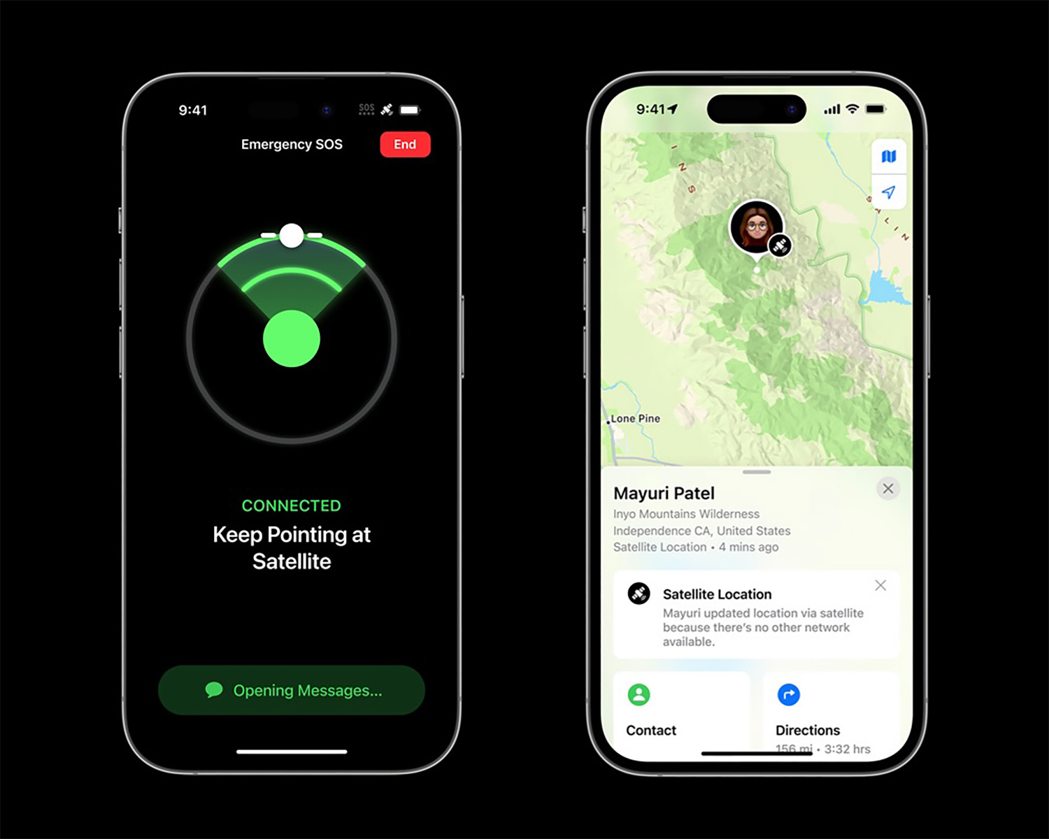
I know that Google just said they’d work on satellite connectivity for next year’s Android 14 – we now know why they made that random announcement last week. It had nothing to do with T-Mobile and SpaceX, and everything to do with what Apple was about to announce for the iPhone 14 and iPhone 14 Pro.
Apple announced that its new iPhones can connect to satellites when you are stuck in an emergency situation without cellular connectivity. This satellite connectivity means pointing your iPhone towards open spaces until it finds a satellite it can lock onto. From there, it can send messages or a bunch of pre-answered questions, like location, medical ID, battery level, etc. You can even use this new connectivity option to share your location with friends if you are out on a hike without regular connectivity.
This new satellite service is free for now for iPhone 14 users for the next two years. I’m not sure what Apple will charge or if they’ve said, but this is really cool stuff, especially for those who enjoy the outdoors.
My guess is that Google will build similar connectivity into Android 14, but it’s pretty wild to see that Apple is already launching it.
There’s probably more cool stuff too
Those three things really stuck out to me from Apple’s event today, yet there’s probably more that you might care about. Apple introduced an upgraded camera system again on the 14 Pro line, got rid of the SIM tray and is all-in on eSIM, introduced the new A16 Bionic chip that likely won’t ever stop laughing at whatever Qualcomm recently announced, and there are size options, including a 6.1″ iPhone 14 Pro for those who don’t want to carry around a tablet.
Come on Android friends, we can do better.
Source by www.droid-life.com


