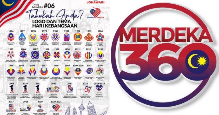
It’s been a few days since the WiFi symbol-like logo for National Day and Malaysia Day was released. Now, as the clamour and disapproval from Malaysians have died down, I have to admit—the logo isn’t really that bad.
Hear me out.
Let’s talk about the design
Visually speaking, there is certainly cause for confusion here. The logo’s connection to Malaysia is not immediately clear, which is not ideal for a National Day logo.
Many of the previous years’ have typically used Jalur Gemilang to establish their relevance to the country.
This year, though, we’re expected to recognise the logo as being Malaysian simply through the red, yellow, and blue. Which could also be representative of Colombia. (Or Burger King…?)
With that said, some of the old designs did have the help of text. This honestly is a bit of a cop-out in creativity to me, as the best icons don’t require text to send their message.
In that context, perhaps this year’s logo is not that bad. As we know, it bears a resemblance to the WiFi symbol.
On an abstract level, this symbolises connectivity or unity amongst Malaysians. On a literal level, though, this refers to our country’s internet coverage.
According to an official manual by the Ministry of Communications and Multimedia, this year’s logo conceptualises the “jalur liputan internet” to symbolise the ongoing development of infrastructure, communication systems, and digitalisation for the convenience of the people.
Bearing this in mind then, I think the new logo does the job. Not to mention, the three colours also represent the different ethnicities in Malaysia living harmoniously, which is a pretty decent sentiment.
But it’s not (just) about the design
Obviously, the design just isn’t clicking with Malaysians. At least, the ones that have been speaking about it on the internet.
A quick search on Twitter will show you that many netizens are mocking the logo, with infamous political cartoonist Fahmi Reza joining in as well.
More than mocking the design, though, the true intention of these posts is to question the government for even choosing such a design.
Beyond the aesthetics, people are confused about the theme of internet coverage. In an article regarding the logo, Soya Cincau wrote:
Connectivity has been a contentious point in Malaysia especially with the delay of mass 5G adoption. While Malaysia currently ranks #2 for fastest 5G download speeds by Opensignal, it lags behind other ASEAN countries when it comes to coverage and service availability.
There’s also the issue of internet inequality in Malaysia. In a New Straits Times article about a poor student who had to climb a tree to get Internet connection in 2021, they wrote, “The divide between the poor student in rural Sabah and the deputy minister in urban Peninsular Malaysia was too big to fathom.”
They also reported that broadband subscription for the B40 group is 49.3% (a jarring number compared to 90.7% for the M40 and 99.7% for the T20).
All this to say, Malaysia still has glaring connectivity problems, which is why the usage of the WiFi symbol as our new national logo feels like more than just a joke to many.
In defense of the logo
Though there is still a clear digital divide between B40 internet connectivity versus that of other income groups’, Malaysia’s overall Internet penetration is at 89.6%, according to the World Bank.
This is much higher than Indonesia’s 53.7%, higher than even Singapore’s 75.9%, and comparable to the United States’ 89.4%. So maybe internet connectivity as a theme isn’t too outlandish.
(Yes, 5G is still lacking in the country. But 5G alone isn’t equivalent to internet connectivity.)
In any case, though, the logo itself isn’t to boast about how strong our internet is. Based on the manual mentioned earlier, it’s clear that it’s more of an indication of Malaysia’s ongoing and upcoming efforts with coverage and infrastructure.
For instance, Communications and Multimedia Minister Tan Sri Annuar Musa did announce that the sale of 70% of Digital Nasional Berhad (DNB, Malaysia’s special-purpose vehicle company) to six telcos will be finalised in July.
For context, DNB is the only institution mandated to roll out a national 5G network, so other telcos can only offer 5G through a wholesale agreement.
In terms of internet inequality, RM30 million was allocated in Budget 2022 for the provision of internet facilities at 40 People’s Housing Projects.
So, for those who are complaining that WiFi in Malaysia is still unstable, that isn’t the point at all. The logo is a marker of the progress being made, not to brag about our occasionally spotty internet connection.
-//-
There’s no doubt that today’s political climate is rather volatile, and attitudes towards government are not exactly the most positive.
With this in mind, any logo that strayed from past ones might have garnered the same type of reaction. Some of the complaints we’ve seen aren’t really about the logo itself though, and were instead a symbol (literally) of Malaysians’ unrest and dissatisfaction toward a much greater issue at hand.
In any case, dissing the National Day logo is not new, and people have found various faults in the past few years’ logos to criticise too.
But if there’s one small thing to be grateful for, it’s that it is through the internet that we are able to talk about this logo and mock its design.
Plus, I see the way we collectively came to mock it is proof that there is harmony and connectivity still to celebrate in our country.
- Read other articles we’ve written about Malaysia here.
Featured Image Credit: Ministry of Communications and Multimedia Malaysia
Source by vulcanpost.com


