After years of twice-annual Windows 10 feature updates, the yearlong wait for the first feature update to Windows 11 has seemed especially lengthy. But the Windows 11 2022 Update, version 22H2, is here at last. (The “22” stands for the year 2022, and “H2” means it’s being released in the second half of the year.)
Unlike the frequently released quality and security updates, which fix bugs, plug security holes, and occasionally add a feature or two, feature updates typically add a host of new features to the OS, so there’s been a lot of anticipation about 22H2.
What’s in it? Does it live up to its billing, or is it a dud? I’ve been living with it for quite some time, and here are my answers to those questions and pretty much anything else you’d like to know about it.
Start menu tweaks
As with so many Windows feature updates, in this one Microsoft continues to fiddle with the Start menu. This time there’s nothing major, though, only a few minor tweaks.
My favorite addition is the ability to create folders to organize your apps, as you could in Windows 10 — a feature that Microsoft unaccountably eliminated in Windows 11. So you can, for example, group PowerPoint, a graphics program, and a video editor in the same folder so they’re easy to find when you create presentations.
Unfortunately, Microsoft seemed to go out of its way to hide this feature. There’s no obvious way to do it — although once you learn it, it’s a breeze to do:
Drag one of the Start menu’s pinned icons onto the icon of an app you want to group it with. Then release it. Both apps will now appear as small icons in an icon simply called Folder. (Note that the Start menu is a bit finicky about where exactly you need to drop the icon, so it may take you a shot or two to do it.) Drag more apps into that folder if you’d like.
Once you’re done, double-click it. The folder opens with your icons in it, and the text “Folder” at the top. Type in a new name for the folder.
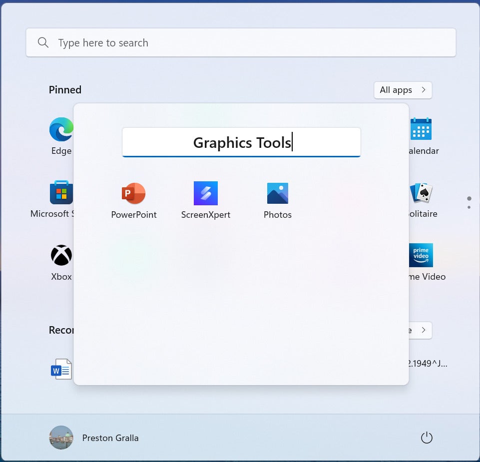
Creating a new Start menu folder.
To run any app in a folder, click it. You can keep adding apps to a folder at any time.
You can’t directly delete a Start folder, though. Instead, drag all the app icons out of it. When you do, the folder disappears.
You can also now choose from three different Start menu layouts: The one you’re familiar with in Windows 11, which is the default; one titled “More pins,” which adds extra rows for pinned apps and a smaller recommendations area; and one titled “More recommendations,” which makes the recommendations area larger and eliminates a row of pinned apps.
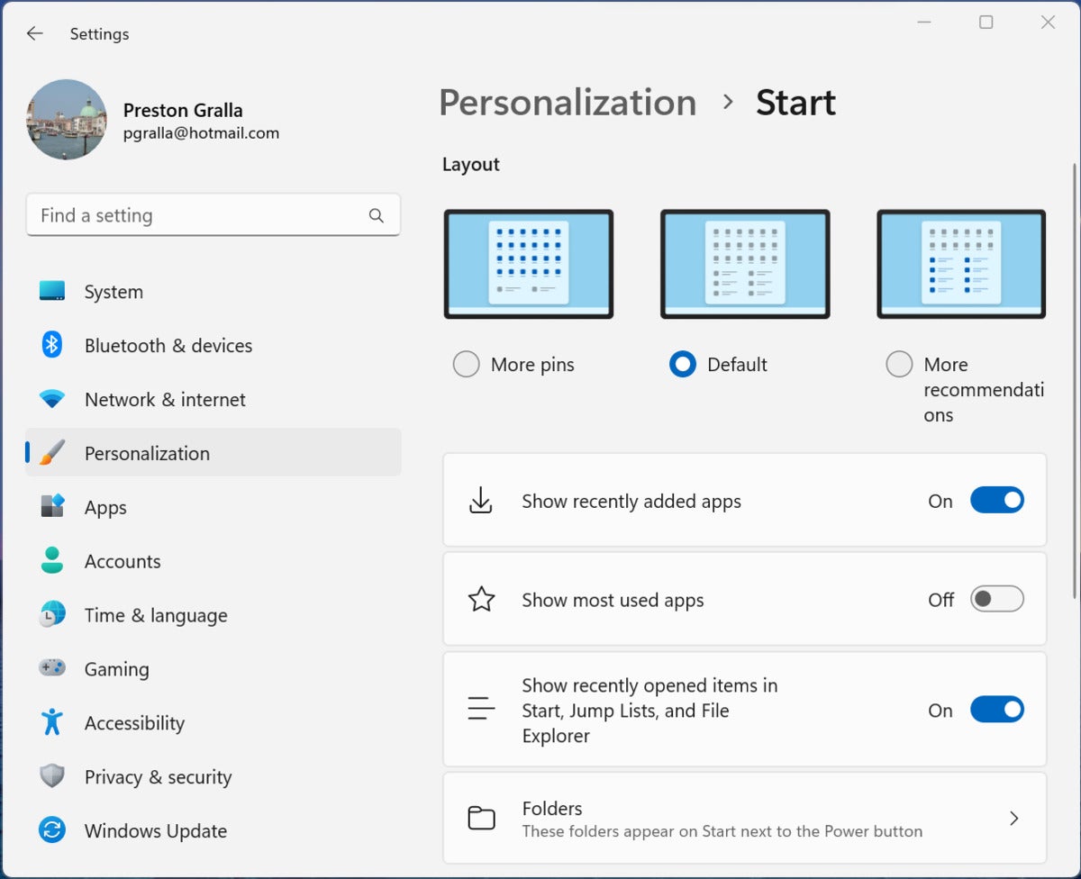
You can now choose from one of three Start menu layouts.
Start got a few more minor tweaks, such as being able to pin an app to the taskbar from the Start menu, rather than having to do that using All Apps — just right-click the app in Start you want to pin and choose Pin to taskbar from the menu that appears. You can also refresh the Recommended area to give you the most up-to-date recommendations by right-clicking Recommended and selecting Refresh.
And that’s pretty much it for the Start menu. Not a whole lot, but it’s nice to get folders back, at least.
A revamped Task Manager
Tweakers and those who fiddle with their system to do things like check memory usage or disable programs that run on startup will be pleased to see an improved Task Manager. Mostly the interface has been improved, although there are a few new useful features as well.
Let’s start with the interface. Instead of the previous layout of tabs across the top for processes, performance, startup apps, and so on, they’re now icons running vertically down a sidebar at the left. The icons are large, with substantial space between them, so they’re much easier to see than the previous tabs. Overall, the look is more pleasing and easier on the eye.
However, there is one drawback to this new design — if your Task Manager window is sized fairly small (as is likely the case if you’re using a laptop without a large screen), the icons aren’t labelled, and it’s not obvious what they mean. You may be surprised to know, for example, that clicking the icon of three squares configured at a right angle will bring you to Processes, or that the speedometer icon will lead you to Startup Apps.
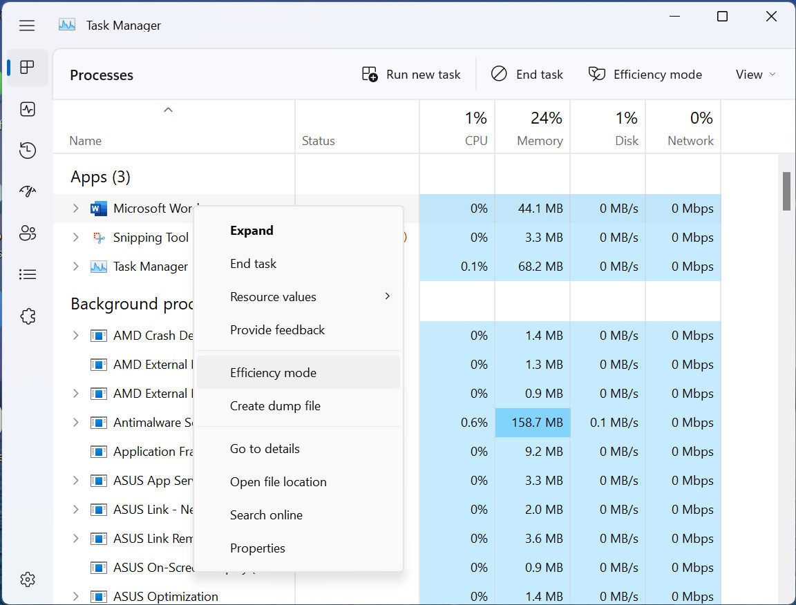
The Task Manager sports a redesigned look and a new Efficiency Mode that lets you limit how many resources specific apps use, in order to speed up your PC. (Click image to enlarge it.)
To see what each icon means, resize your Task Manager window larger, and you should see both icons and text labels for them. Again, though, you might not be able to size the window large enough for the text labels to appear on laptops with small screens. If that’s the case with you, or if you want to keep the window small, click the “hamburger menu” of three horizonal lines at the top of the icons to make the text labels appear. Click one, you’ll head there, and the text labels will disappear to give you back more screen real estate.
The menu at the top of the old Task Manager (File, Options, and View) has been replaced with a single settings screen, accessible via the Settings icon at the bottom of the left sidebar, and a small horizontal menu at the top of the screen that lets you accomplish simple tasks such as running a new task.
One especially useful new feature for those who use Task Manager to speed up their systems is a new Efficiency mode that lets you limit how many resources specific apps use. Right-click any app that is consuming a high amount of resources and select Efficiency mode from the menu that appears. Note that you won’t be able to use Efficiency mode on core Windows processes. When you right-click any app or process that can’t use Efficiency mode, that setting will be grayed out on the menu.
Windows on its own sometimes suspends processes or apps to improve performance. In the new Task Manager, you’ll see an icon next to any app or process that has been suspended.
One final useful feature: Task Manager now has keyboard shortcuts for performing certain tasks. Press the Alt key to see which are available. Here are some useful ones:
- Alt-E – End a selected task
- Alt-M – Put a selected or app into efficiency mode, or remove it from efficiency mode
- Alt-N – Run a new task
All in all, these changes add up to something significant, although only for people who regularly tinker with their system.
File Explorer and OneDrive integration
I’ll get right to the bad news: Windows 11 22H2 doesn’t have the long-awaited and long-promised Tabs feature for File Explorer. Microsoft says that feature will be added in an October update.
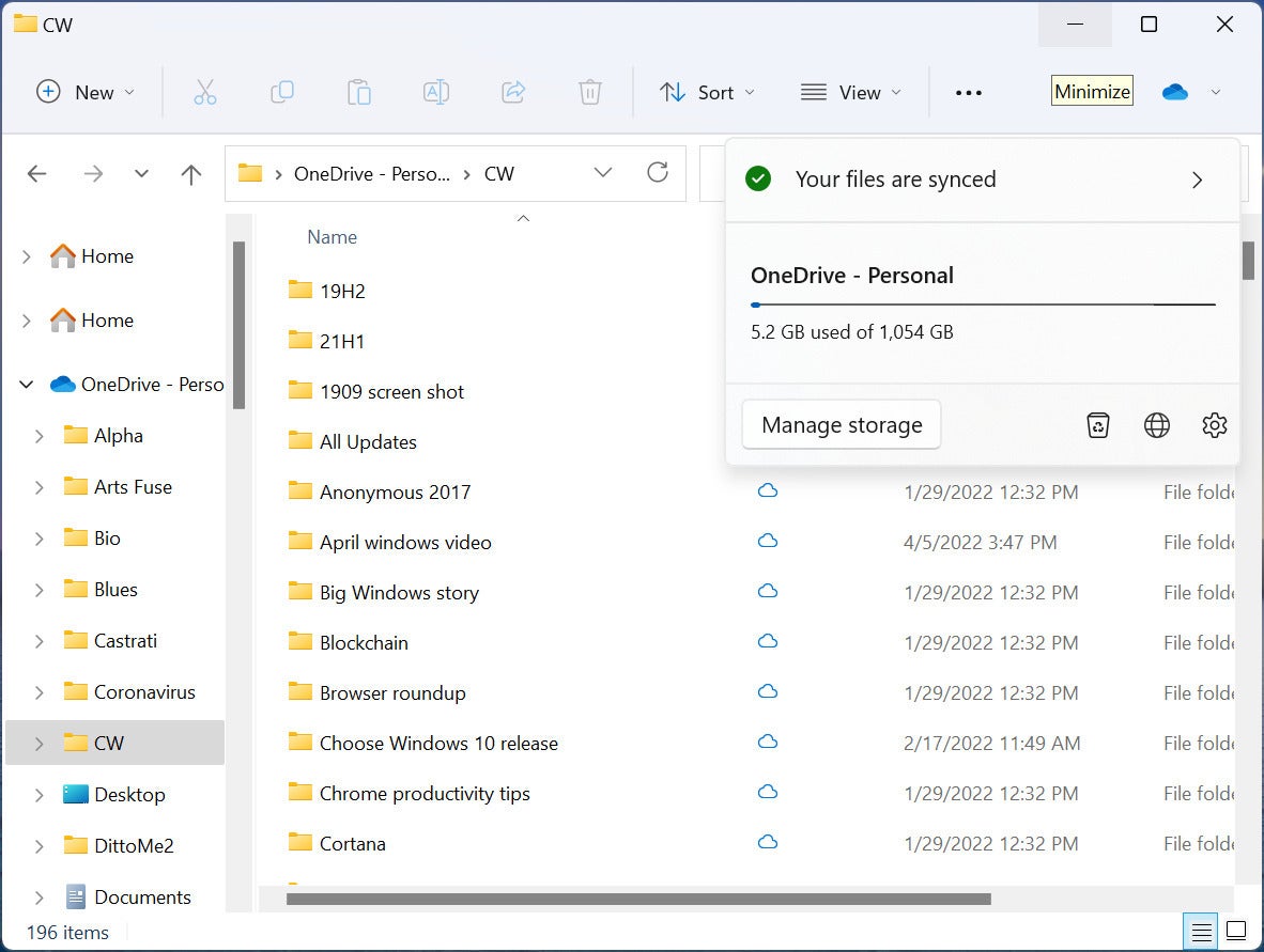
There are a few relatively useful minor changes, though. OneDrive users will be particularly pleased with File Explorer’s improved integration with OneDrive. You can now open File Explorer directly to OneDrive. To do it, click the three-dot menu icon on the top right of the screen, select Options > General, and in the “Open File Explorer to:” drop-down, select OneDrive.
File Explorer includes improved integration with OneDrive. (Click image to enlarge it.)
In addition, on the upper right there’s an icon for OneDrive that when clicked shows you its sync status, total capacity, and total space used, and provides quick access to settings and options for managing storage. The icon only appears if you’re currently viewing a OneDrive folder.
Given that OneDrive was launched 15 years ago, it’s odd that Microsoft took so long to offer these types of integrations. Still, I believe I speak for all OneDrive users when I say we’ll take what we can get.
File Explorer also gets a minor face lift, including a cleaner-looking, more useful left navigation pane that lets you get to frequently used folders and pinned folders. And there are other small changes as well, including the ability to search through recent and favorite files, even if those files are not local ones.
All this is to the good. But it doesn’t add up to a lot. Putting tabs on File Explorer would, so let’s hope it really is coming our way.
New touchscreen gestures
If you have a touchscreen device, you get several new touch gestures, which is helpful. Here are some of the most useful:
Toggle the Start menu. Swipe up from the taskbar to open the Start menu. Wipe down on Start to toggle it off.
Minimize apps. Swipe down with three fingers.
Toggle All Apps in Start. Swipe to the left on the Start menu’s Pinned area to display All Apps. Swipe to toggle them off.
Open Quick Settings. Swipe from the right.
Switch between running apps. Use a three-finger swipe to the left or right
Switch to the previously used app. Swiping left or right with three fingers.
What’s up with the taskbar?
The Windows Taskbar got one useful feature in this update, being able to drag and drop a file onto a taskbar app icon and have the file open in that app as you can do in Windows 10. No, it’s not earthshaking. But in an update that includes so few truly useful new features, it stands out.
Look hard enough beyond that and you’ll find a few insignificant tweaks, but don’t blink or you’ll miss them. For example, you can now control the volume level on the taskbar volume control using the scroll in a mouse wheel. (Be still, my beating heart!)
Built-in video editing
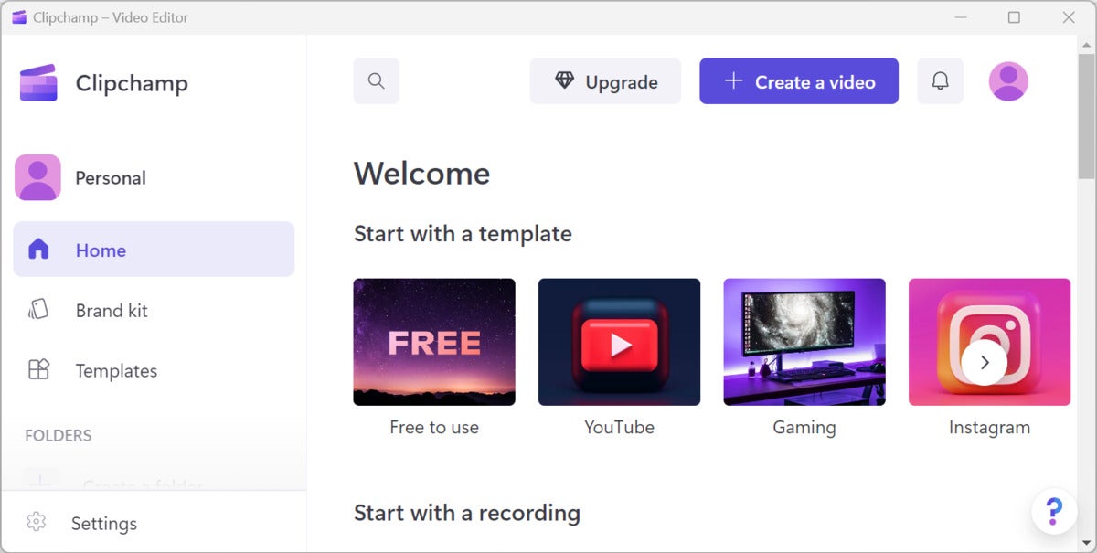
Included in 22H2 is Clipchamp, a free, basic video editor that’s suitable for simple editing tasks. It’s not a new app; Microsoft bought the app in 2021, and it’s already been available in the Microsoft Store for either Windows 10 or Windows 11.
It’s a straightforward, useful video editor with templates that give you a start on creating many different types of videos, including for slideshows, ads, and social media posts. You can use already-existing videos and images from your PC or stock collections, import video from other sources, record video, and take screen shots as well. Also included are transitions, overlays, and some special effects, as well as the ability to create titles.
The free Clipchamp video editor is built into Windows 11. (Click image to enlarge it.)
You won’t find advanced tools here, such as motion tracking or advanced special effects. But face it, you can’t beat free. There’s also an “Essentials” version you can upgrade to for $12 a month ($8 for the first month). Essentials includes more powerful and varied filters and effects; the ability to brand video content; online backup; and more, higher-quality audio, video, and image stock.
Settings tweaks
Microsoft always takes the opportunity to change the Settings app whenever it releases a feature upgrade, and this time is no different. Many are cosmetic or use different text than the previous version of Windows 11, although there are a variety of new settings as well, such as a setting that will show recent searches when you hover over the Search icon on the taskbar. There are a variety of other tweaks throughout Settings, including the ability to turn off the System Tray overflow menu, have Bing show you a different image every day as your desktop wallpaper, and others.
A new Settings option lets you display your search history when hovering over the taskbar’s search icon. (Click image to enlarge it.)
Oddly enough, Microsoft appears to have undone some of the changes it made during earlier releases of 22H2. For example, a facelift to Settings app’s Accounts page offered a great deal of information at a glance, such as whether you have Microsoft 365 installed, and if so, what version and how much you’re paying for it. That’s gone in the most recent 22H2 release.
Yet more tweaks
You’ll find plenty of other tweaks sprinkled throughout the operating system. The most important is to the Snap Layouts feature, which lets you group your open windows into one of a half-dozen pre-built screen layouts. In the update to Windows 11, you’ll be able to drag a window to the top of the screen and then drop it into a snap layout. In addition, Task View (Windows key + Tab) will show your Snap Groups so you can easily switch between them.
Here’s the new Snap Layouts in action. (Click image to enlarge it.)
How much you’ll like this tweak depends upon whether you find Snap Layouts useful or even use it at all. I’ve tried my hardest to like it ever since it was introduced, but to no avail. I find it pointless, confusing and more trouble than it’s worth. But as the saying goes, your mileage may vary.
A tweak may help you reduce carbon emissions. Depending upon where you live, you may see “Windows Update is committed to helping reduce carbon emissions” message on the Windows Update page. If you do, Windows will attempt to schedule updates at times that may reduce carbon emissions — for example, when solar or hydro power is used more by your utility company. Microsoft uses “regional carbon intensity data” from Electricity Maps and WattTime to determine those times. Microsoft isn’t saying, though, how much this practice might reduce emissions.
What IT needs to know about 22H2
There’s not much new in this upgrade for IT. Sys admins get some new group policies for controlling the Start menu, taskbar, and system tray for their users. Here’s the list:
- Disable Quick Settings flyout
- Disable Notification Center and calendar flyouts
- Disable all taskbar settings
- Disable search (across Start & taskbar)
- Hide Task View from taskbar
- Block customization of ‘Pinned’ in Start
- Hide ‘Recommended’ in Start
- Disable Start context menus
- Hide ‘All apps’ in Start
“Microsoft Patch Lady” Susan Bradley points out that there’s also a new group policy default with an account lockout policy “to mitigate Remote Desktop Protocol and other brute force password vectors.” Before this, she notes, “admins couldn’t set an account lockout policy on Administrator accounts via RDP unless you left the password blank. Clearly this is not ideal and not recommended.”
Security has been enhanced in several ways. Devices that have Intel 8th generation chipsets and higher will use virtualization-based security (VBS) and hypervisor-protected code integrity (HVCI) by default. That protects against malware, ransomware, and more sophisticated attacks. So do improvements to Microsoft Defender SmartScreen and Smart App Control, and enabling Windows Credential Guard by default on devices running Windows 11 Enterprise.
As for how enterprises can get the update, Microsoft says: “Windows 11, version 22H2 is available through familiar channels and processes including Windows Server Update Services (WSUS), Windows Update for Business, and the Volume Licensing Service Center (VLSC) for phased deployment using Microsoft Endpoint Manager or other endpoint management solutions.” It adds, “September 20, 2022 marks the start of the 36 months of servicing support lifecycle for Enterprise and Education editions of Windows 11, version 22H2.”
Bottom line
So what does all this add up to? Not much. Calling 22H2 a feature update is a stretch at best. There’s little new here, and even less that’s useful. Bringing back Start menu folders is a nice little addition, and system tweakers will be quite pleased with the new Task Manager, but the change that many people were most looking forward to — tabs in File Explorer — is missing. There’s also little here for IT and enterprises.
So go ahead and install it when you feel it’s been out in the wild long enough to become as bug-free as possible. Just don’t expect much of a difference after you install it.
Expect 22H2 to improve gradually over time. Microsoft says that from now on, Windows will get feature updates like 22H2 once a year, but that in between, individual new features may be released as often as once a month. That will happen in October, when Microsoft will release an update that delivers tabs to File Explorer. The update will be optional and delivered via a phased rollout, and will then be included in the normal monthly security update release in November.
Keep that in mind when deciding when or whether to install 22H2. Those new features won’t be made available to earlier versions of Windows 11.
Copyright © 2022 IDG Communications, Inc.
Source by www.computerworld.com


